ABOUT THIS PROJECT:
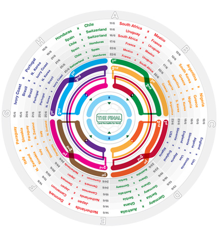
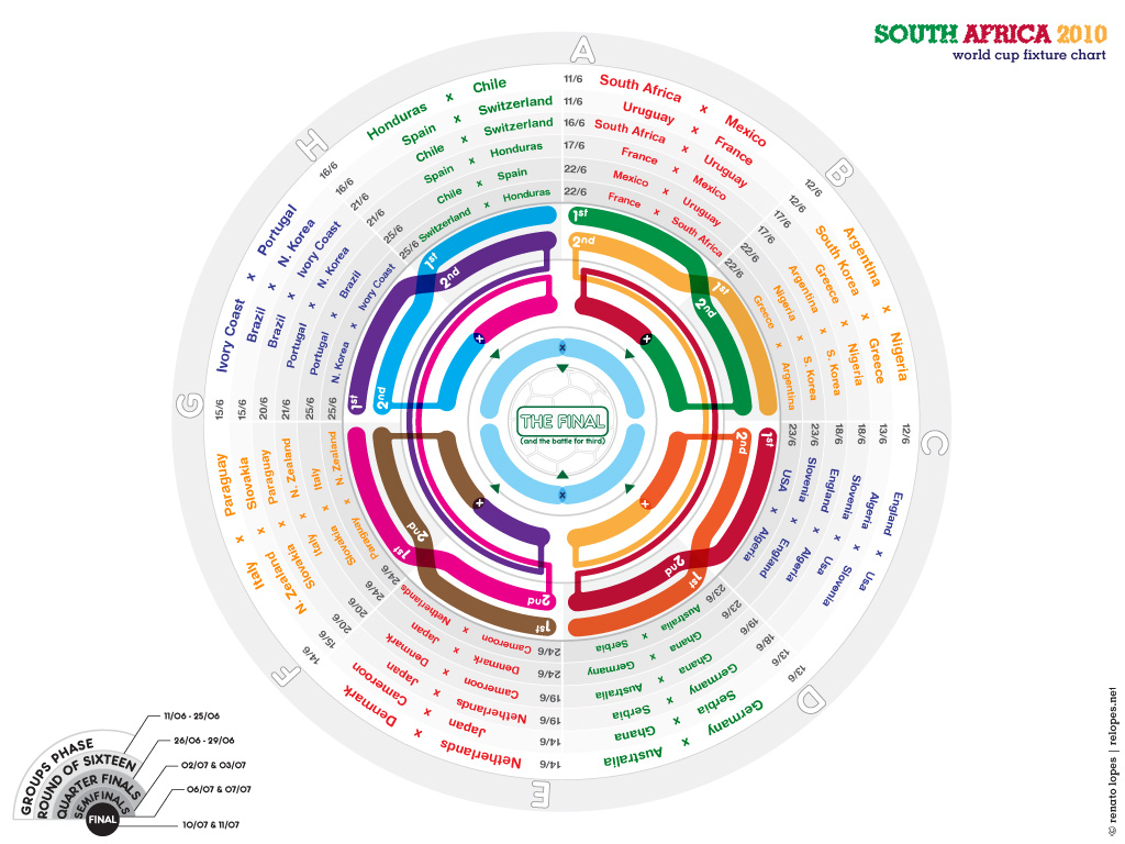
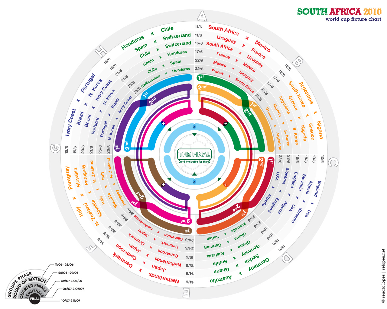
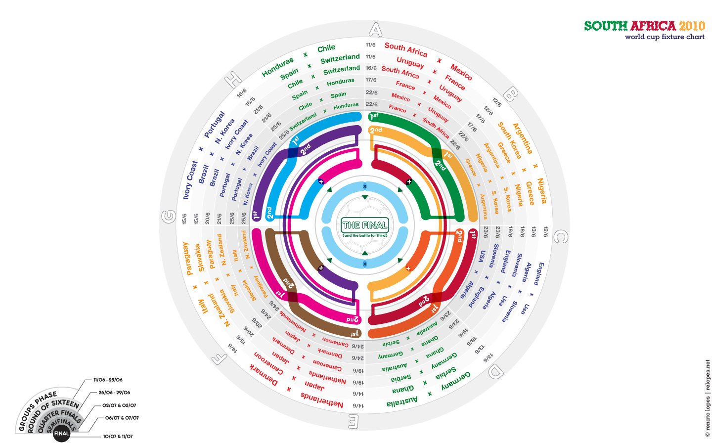
I decided to do this experiment on infographics after noticing how fixture charts usually look unintersting and follow the same structure.
This is my take at organizing the world cup matches in a more interesting and less usual way.
You are welcome to download and redistribute if you liked it.
And even if you didn't, I'd still
love to hear what you think of it, so feel free to drop an email at .
Enjoy,
Renato
- Printable pdfs please note: these files make use of transparencies from illustrator. You should be fine unless you have a very early version of a pdf reader.
-
Desktop versions
- 1024 x 768 pixels
- 1280 x 1024 pixels
- 1280 x 800 pixels (widescreen)
- 1440 x 900 pixels (widescreen)
 .
.